The Girl Scout identity uses three core colors, green (PMS 355), black, and white.
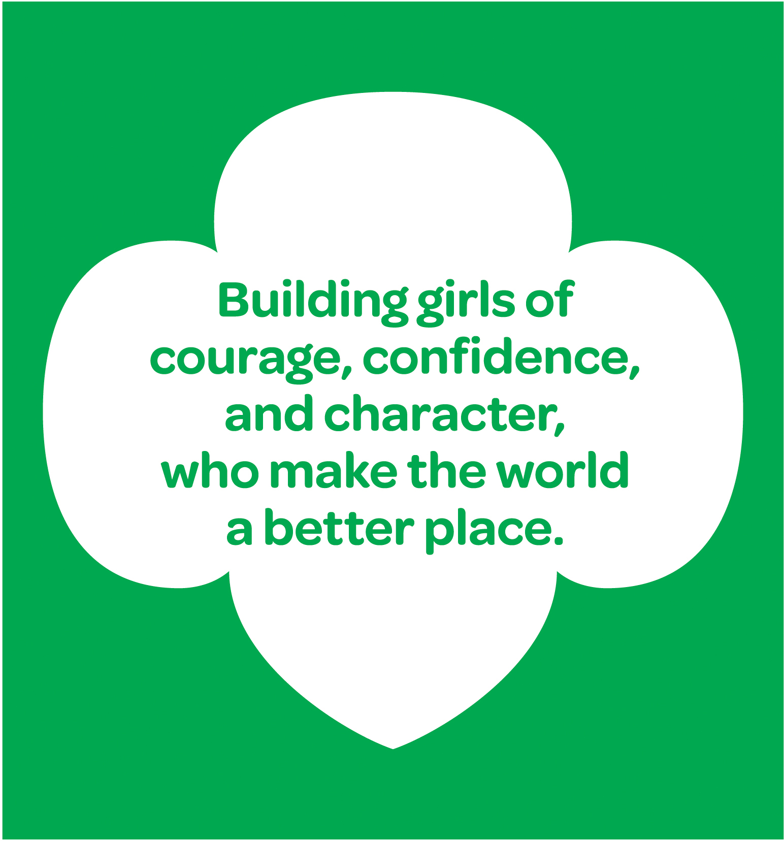
Girl Scouts has the privilege of claiming a color. Green.
Girl Scouts has chosen to use the Pantone Color Matching System to ensure the correct “green” is used every time. When taking an item to a professional printer, specify Girl Scout Green as PMS 355 to make sure they use the proper ink color.
To ensure that we continue to claim the color and to capitalize on our well-established advantage, embrace green.
When creating materials for girls and parents, use the core colors with Trefoils and/or illustrations to add fun, playful energy to a design.
For audiences like potential partners, alumnae, and donors, a restricted color palette helps establish a more serious, adult tone. Use photography to add pops of color to the mix.
While Girl Scout green remains a primary element of our brand, sometimes we need additional colors to bring hierarchy, contrast, and vibrancy to our designs. These eight secondary colors appeal to girls inside and outside our Movement. To narrow down the selection, we streamlined color palettes used in campaigns, cookie marketing, and program materials, eliminating colors that were too similar.
Secondary colors can be used for important callouts, charts, graphs, or other infographic needs. Using Girl Scout green as the consistent thread—for page header copy, footer elements, backgrounds, callouts, or other design elements—helps keep designs simple and easily distinguishable as “Girl Scouts.”
In primarily green designs, emphasize messages and illustrations with pops of color.
When using multiple colors for infographics or illustrations, stick to Girl Scout green for headers and calls to action, and add pops of color to special data or illustrations.
We’ve selected and tested some neutral colors and tints to use in conjunction with our core and secondary colors. Use these colors to add structure to a design or frame content in a layout. They are handy for backgrounds, sidebars, callouts, and charts.